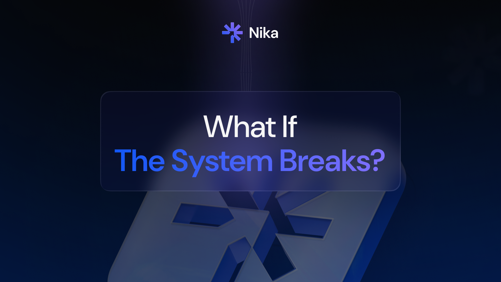
Why Making DeFi "Easier" Kept Making It Worse

For the past five years, every major DeFi platform has described itself as simple.
"Simple for beginners." "Easy to use." "DeFi made accessible."
None of them were. And the reason reveals something important about how the industry thought about the problem — and why it kept solving the wrong one.
The standard approach to making DeFi more accessible was to add a better interface on top of a complicated system. Cleaner buttons. Prettier charts. A friendlier onboarding flow that still ended with "now go buy ETH to pay for gas."
This is like making a cockpit more accessible by replacing the instrument labels with emojis. The complexity is still there. You just can't read it anymore.
Real simplicity isn't a design layer. It's an architectural decision.
It means asking: what should the user never have to think about? And then actually removing those things from the experience — not hiding them behind a dropdown menu.
Gas fees are a perfect example. For years, the solution to "gas fees are confusing and expensive" was to show users a gas fee estimator. A better interface for a problem that should have been eliminated entirely.
The right answer — which took too long to arrive — was to sponsor gas on behalf of users. Cover it. Make it invisible. Let people trade without ever thinking about it.
Same story with seed phrases. The industry's solution to "seed phrases are scary and people lose them" was to write better documentation about how to store seed phrases. The right answer was MPC key management — splitting the key so that no single party holds it, meaning users get full self-custody without a piece of paper that determines whether they ever see their assets again.
Same story with bridges. The solution to "bridges are confusing and sometimes fail" was better bridge UIs. The right answer was an intent-based system where you say what you want and off-chain solvers compete to find the best route — you never touch a bridge at all.
The pattern is consistent. The industry kept building better interfaces for problems that should have been eliminated at the infrastructure level.
Why? Because eliminating the problem is harder than designing around it. Sponsoring gas costs money. MPC infrastructure requires significant engineering. Intent-based routing requires building relationships with multiple liquidity providers and solver networks.
The shortcuts were cheaper to build. And for a long time, users didn't have an alternative, so they accepted the complexity as the price of entry.
That price is no longer required.
Nika was built from the first principle of what users should never have to think about — and then worked backward to the infrastructure required to make that true. No gas management. No seed phrases. No bridge selection. No approval flows. No choosing which liquidity pool to use.
You specify what you want. The system handles everything between your intention and the outcome.
This isn't a minor UX improvement. It's a different philosophy about what the product is supposed to do.
The simplest DeFi experience isn't a better tutorial. It's a system that makes the tutorial unnecessary.


.svg)
© 2026 Nika.
All rights reserved.
Copyright © 2025 Nika Finance Inc. All rights reserved.
%20(1).avif)